Best Paint Colors for Tudor Homes (Interior & Exterior)

Choosing the perfect Tudor home paint colors is one of the most impactful ways to bring your house to life. Tudor-style homes already have so much charm, think dramatic rooflines, cozy nooks, and beautiful trim details, so the right color palette should enhance that character, not compete with it. Whether you’re tackling an interior refresh or updating your home’s exterior, paint is one of the simplest and most powerful tools you have.
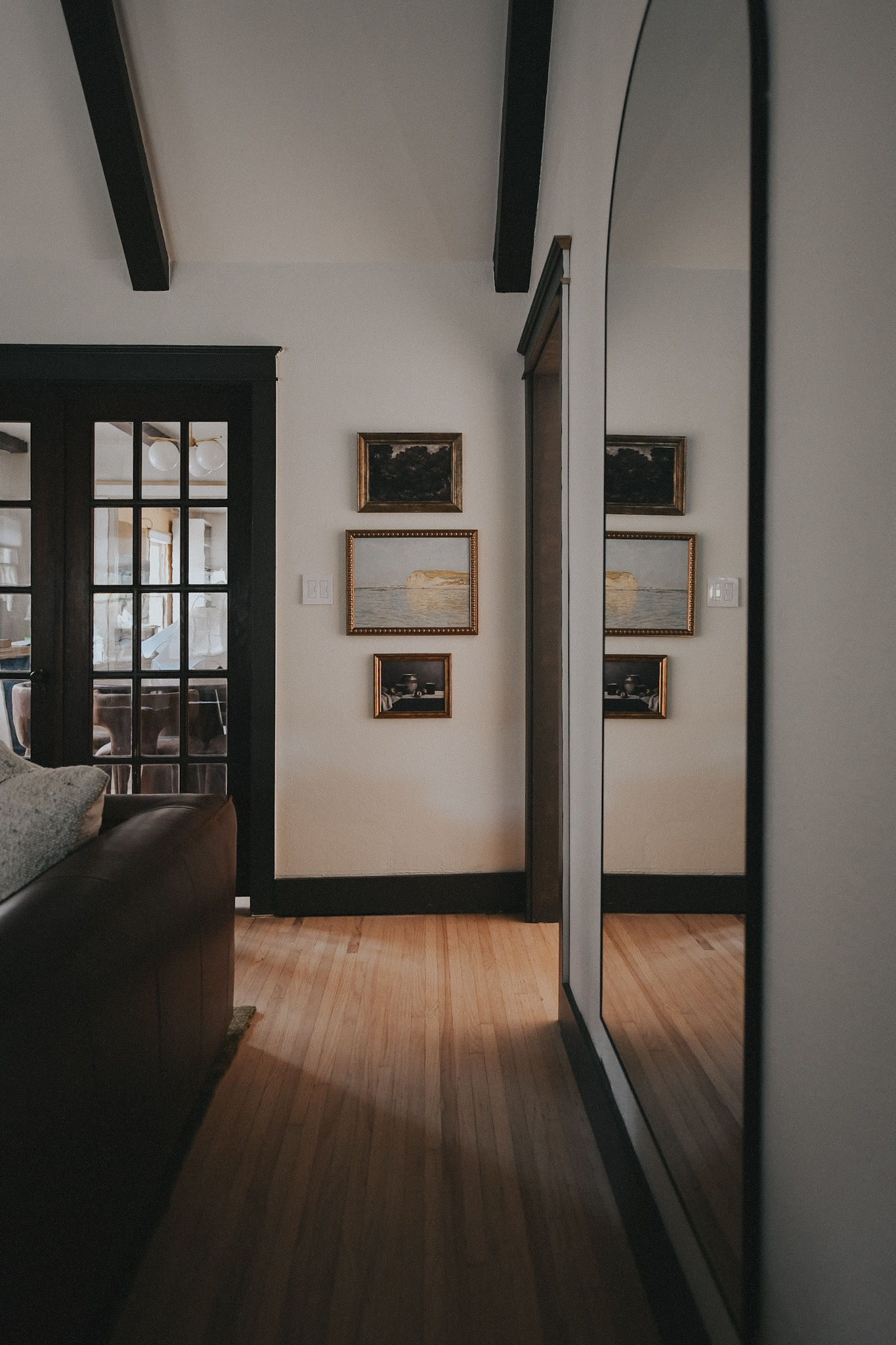
When it comes to the best colors for old houses, timeless always wins. Warm neutrals, creamy whites, and soft, muted colors help you keep that classic look while making your home feel fresh and updated. For interiors, these colors balance out dark wood trim and bring a light, airy feel to spaces that might otherwise feel heavy. For exteriors, warm whites paired with deep, contrasting trim colors frame your Tudor architecture beautifully and give it that crisp, classic look we all love.
We believe every color choice should feel intentional and we love sharing palettes that feel right for a historic home while working with a modern lifestyle. Below are some of our favorite Tudor home paint colors for both interiors and exteriors that will help you create a cohesive, beautiful home.
Interior Paint Colors for Tudor Homes
Tudor interiors often have rich wood trim and cozy spaces, so wall colors that feel soft and warm are key. These are some of our favorites:
- Benjamin Moore White Dove (OC-17) – A soft, creamy white that works beautifully with dark trim.
- Sherwin-Williams Alabaster (SW 7008) – A warm white that feels light but not stark.
- Farrow & Ball Skimming Stone – A light, warm gray with depth, perfect for dining rooms or bedrooms.
- Benjamin Moore Saybrook Sage (HC-114) – A muted green that brings a touch of nature inside.
- Sherwin-Williams Accessible Beige (SW 7036) – A warm, neutral beige that adds coziness to living spaces.
Exterior Paint Colors for Tudor Homes
For exteriors, contrast is everything. A light body color with dark trim makes Tudor details pop and keeps things looking classic. Try these combinations:
- Main Body – Benjamin Moore Simply White (OC-117) + Trim – Benjamin Moore Wrought Iron (a soft black)
- Main Body – Sherwin-Williams Shoji White (SW 7042) + Trim – Sherwin-Williams Tricorn Black (SW 6258)
- Main Body – Farrow & Ball Pointing + Trim – Farrow & Ball Railings (a deep charcoal)
- Main Body – Benjamin Moore Balboa Mist (OC-27) + Trim – Benjamin Moore Kendall Charcoal (HC-166)
Tips for Choosing Tudor Home Paint Colors
- Test samples first – Tudor homes often have unique natural light, so look at swatches in morning and afternoon light before committing.
- Honor the architecture – Stick to warm, muted tones that work with historic details rather than against them.
- Consider the flow – Use a cohesive color palette so your rooms connect visually from one space to the next.
- Don’t forget the trim – Trim color is just as important as wall color for getting that authentic Tudor look.
Should Tudor home trim be dark or light?
Traditionally, Tudor home trim is dark (think deep brown, black, or charcoal) to create that classic, high-contrast look. Dark trim highlights the half-timbering and architectural details that make a Tudor so special. That said, you can absolutely choose a softer look with light trim if you want a more modern or cottage-style vibe. The key is to keep the contrast between the trim and the main body color strong so the Tudor character still shines through.
How do I choose the best colors for an old house?
Choosing the best colors for an old house starts with its style and era. Look at the home’s original details, like wood trim, brick, or stone, to guide your palette. Historic paint collections from brands like Sherwin-Williams or Benjamin Moore are a great place to start. Stick with rich, muted tones that feel timeless. Soft creams, deep greens, warm grays, and earthy browns often work beautifully. The goal is to highlight the character of your home, not cover it up.
Leave a Reply
I create some affiliate links through the Amazon Influencer program and the LTK platform. Because of this, I have the ability to earn small commissions from some purchases that you make while using my links (at no cost to you!). I so appreciate your support.